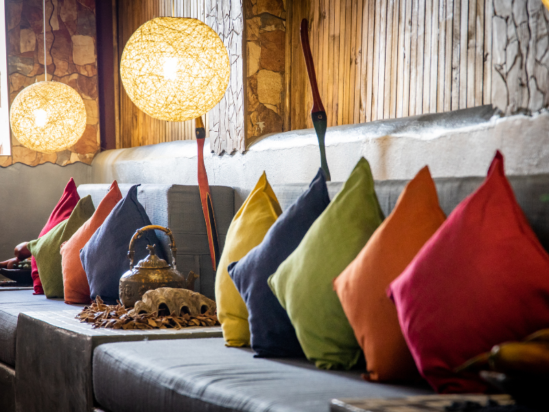
Color evokes an emotional reaction therefore a calm palette with a pop of color can be a very powerful tool to help create the mood of a space.
Generally, warm colors like red, yellow and orange evoke warmth and convey optimism, enthusiasm, and passion. Cool colors such as green, blue, and purple are calming and relaxing while neutral colors like brown, black, white, gray and other earth tones represent simplicity.
Used in an office environment for example red would be the color associated with the leader and driving force, while blue would be perfect for a meeting room where balance and cooperation would be ideal. Green would be the perfect color for a break room where colleagues can relax and have time off while orange might be interspersed in the main working area to encourage creativity.
The same can be applied to a home environment with neutrals reserved for the sleeping areas and brighter colors for the children’s areas and places where the family gathers and guests visit.
The most pleasing spaces have a balance of color where colors and patterns pair well with each other. The easiest way to accomplish this is by using a neutral color palette for the fixed surfaces such as walls, floors and large furniture then introduce either warm or cool tones as accessories, accent pieces or feature walls.
When choosing pop of color consider the purpose of the room and choose accordingly, colors evoke feelings.